According to What's The Big Data forecasts, by the end of 2024, the number of mobile users in the world will reach 7.1 billion (with an annual growth of 5% observed over the past five years). This trend cannot be ignored by website and app owners as, most often, it’s vital for ensuring user engagement and gaining a strong competitive advantage. So, how do you know if you should consider a mobile-first design for your future project, too? Let's figure it out.
What Is Mobile-First Design?
Mobile first web design is a special approach to creating web solutions, which involves developing mobile design first of all. As the main components of the project are implemented, minor ones are added, which is called progressive advancement. With this approach, users of devices with small screens get access to the main functionality immediately, and to other components – through swiping, scrolling, and other features provided by mobile devices.
How Does It Differ from Responsive Web Design?
An alternative to mobile-first design is responsive design, which, in contrast, stretches according to the screen parameters of the user device using the principle of dynamically collapsing blocks. You can learn more about this type of design here:

The Difference with Graceful Degradation
There is also a contrasting approach to creating mobile design – it’s called graceful degradation. According to it, developers first create a complex version of the project and fit it to the compact physical parameters and other limitations of mobile devices. However, following this way, developers often lose the quality of the user experience, so it must be applied very carefully.
Why Is Mobile-First Design Important?
While the main factor in favor of mobile first website design continues to be the growing number of mobile users around the world (we provided statistics and forecasts in the introduction of this article), there are a number of additional business benefits that can increase your confidence in choosing it:
- Improved SEO. Search engines, specifically Google, prefer mobile-friendly web solutions with high loading speed – accordingly, websites and web applications adapted for mobile users will receive an advantage in search results;
- Better user experience. Every year, users become more and more demanding of the web resources they visit and expect them to work effectively on any device. In turn, the mobile first approach will ensure compliance with these requirements for mobile device owners;
- Variety of available technologies. Constantly evolving technologies for mobile development make it possible to create modern web solutions with advanced functionality;
- Higher conversion rates. Optimization for mobile devices reduces bounces and improves conversion by making it easier for users to make purchases or take any other actions on a website or app;
- More effective analytics and marketing. Mobile-first design enables collecting more data about users and their behavior, which allows businesses to develop more effective marketing strategies and analyze results;
- Enhanced competitive advantage. Using mobile-first design can set a business apart from competitors that haven't yet adopted this approach, allowing you to attract more customers and provide them with a better user experience.
Considering all these advantages, we can hardly expect that mobile-first design will lose its popularity in the coming years.
The Connection Between Mobile-First Design and Accessibility
We, the WEZOM team, always focus on the following two aspects when developing solutions with a mobile first UX design.
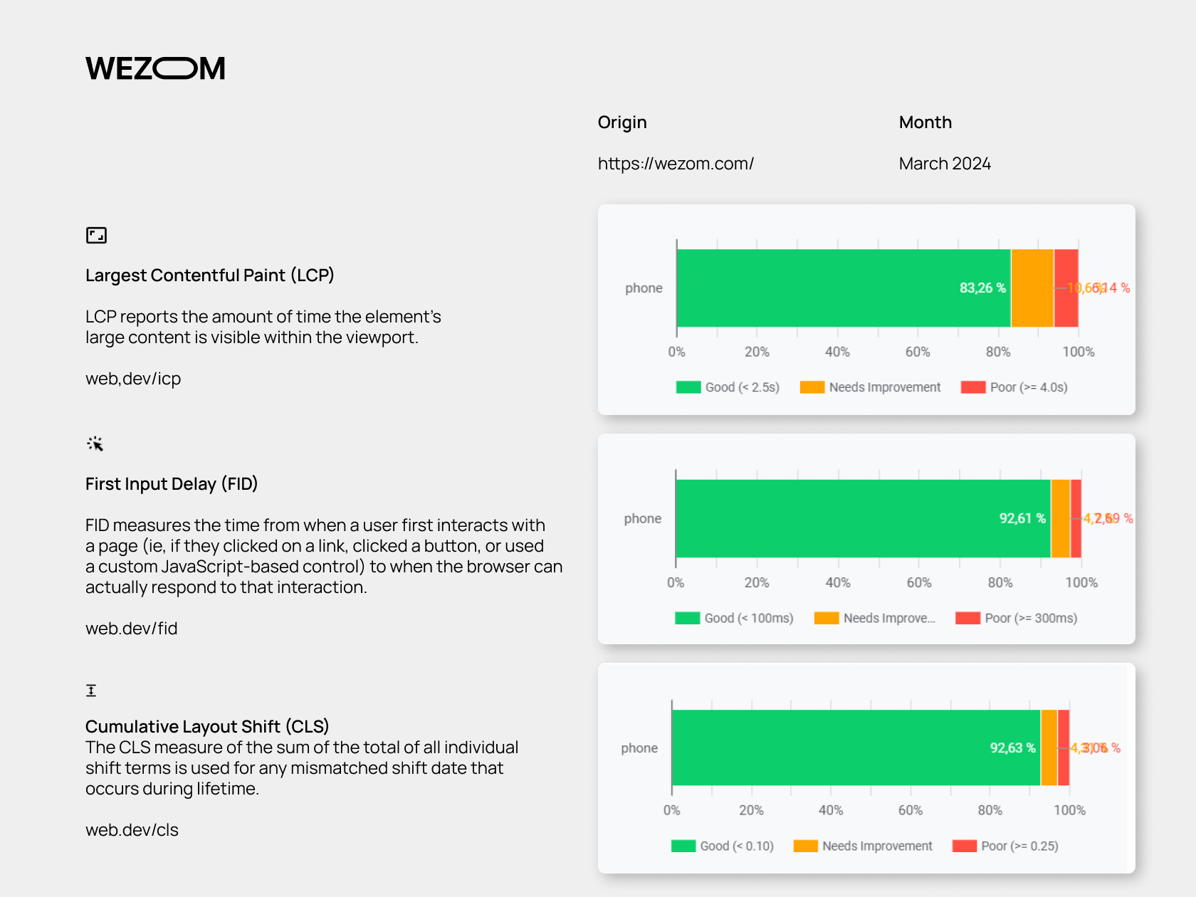
Google Core Web Vitals
Core Web Vitals is a platform that generates reports on the page performance of a specific web solution based on monitoring data about interaction between it and real users. Thanks to the information presented in the reports, you can promptly identify and eliminate shortcomings and errors on your website or web application.
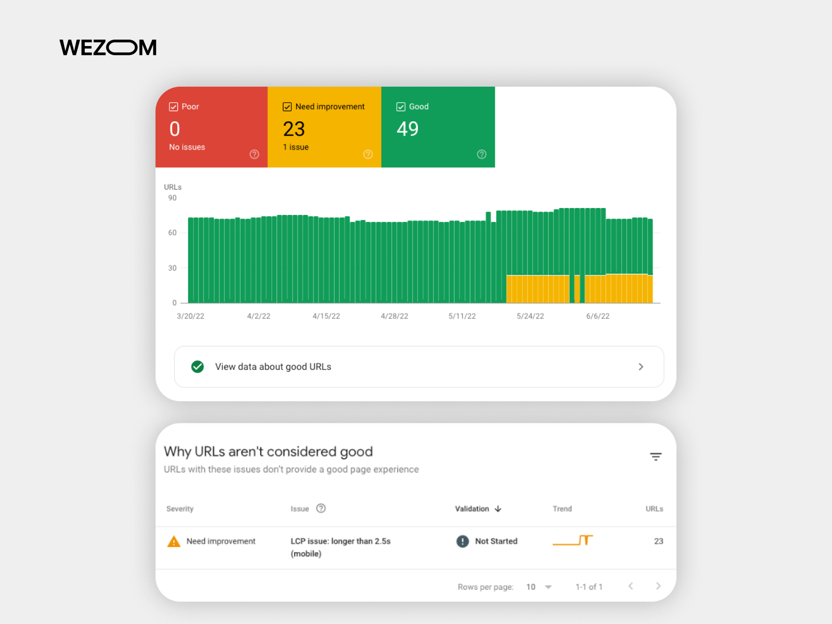
To achieve the best results in reports, the WEZOM team resorts to the following practices:
- Ensuring fast loading of web pages by compressing media files, caching, and reducing server response time;
- Making solutions interactive using JavaScript;
- Maintaining the same page layout regardless of the screen parameters of the specific user device.
Why is all this needed? First of all, for good ranking in the Google search engine as it gives priority to web resources that provide excellent user experience.
Google CrUX (Chrome User Experience Report)
This is another type of report that describes how Chrome users interact with your web solution.
The collected data is available in PageSpeed statistics, Google BigQuery, the CruX control panel in Data Studio, as well as in the Crux API. Overall, this is a useful thing that sometimes provides unique insights necessary to improve the user experience of web solutions in one of the most popular web browsers worldwide, Google Chrome.
Mobile-First & the Software Development Lifecycle
The development cycle for the mobile-first approach looks like this:
- Planning and approval of the concept (description of solution’s capabilities, its goals, etc.);
- Selecting a technology stack (defining frameworks, programming languages, APIs, data collection methods, data security standards, etc.);
- Prototyping (visualization of all ideas and concepts, taking into account the intended user paths);
- Design and programming;
- Testing (manual and automated, including in the supposed deployment environment);
- Deployment;
- Collection of user feedback and optimization.
In general, the mobile first development strategy involves all the same steps as in traditional software development, but the greatest emphasis is placed on providing a high-quality experience primarily for mobile users (usually, if this can be achieved for users with small screens, the desktop user experience will automatically be of high quality).
How to Implement a Mobile-First Design Approach and Achieve the Best Results
Based on the experience of our team, we have obtained the perfect formula for achieving the best results for each mobile-first project of any complexity. In particular, any task related to the implementation of mobile-first design is completed in the best possible way if the designer works simultaneously on both the mobile and desktop versions of the project – of course, considering all the specifics of user devices.
The fact is that no matter how experienced designers are, they do not always have the opportunity to create a mobile version, keeping in mind all the functions that will be needed on a desktop solution. Therefore, when demonstrating the results of our work, we prepare two versions at the same time: mobile and desktop, so that it is easier for the client to evaluate all the advantages of each version in the complex.
Ultimately, this approach minimizes the risks associated with returning the mobile version for revision if the product owner decides to add new specifications to the project only at the stage of work on the desktop version. This means that the product is launched on the market faster than with a linear approach to organizing the mobile-first development process.
How We Build Our Mobile-First Projects
In this paragraph, we would like to describe one of our cases in which we created a mobile first design according to the practice described above. In particular, WEZOM has developed a unique software solution for the presentation and sale of real estate in 22 countries.
The client who approached us represented a company from Kazakhstan that, for about ten years, specialized in finding real estate for housing and investment for its customers around the world. Considering the high prestige that the company has gained over these years, we had to ensure its impressive presence in the web space.
As a result, after agreeing on all the details with the client, we were given the following tasks:
- Development from scratch of a corporate, user-friendly web platform for sales managers, where they could work with projects and which could also be used to present the company’s advantages and services to potential clients, including B2B and large investors;
- Development of an admin panel that would seamlessly integrate with CRM and automate routine tasks for company employees;
- Integration of this platform with customer and real estate databases.
After several months of our work, we launched a digital solution that not only confirmed the high status of the company – both for clients and competitors – but also helped to simplify everyday tasks associated with manual data entry for its employees. Today, the client’s business is evolving more actively than ever before, and the functionality of this platform is gradually expanding by us.
If you would like to learn more about this case, you can read it below:

The Best Practices for Mobile-First Design
Finally, let’s consider the practices that help WEZOM developers create highly competitive and SEO-friendly mobile-first solutions.
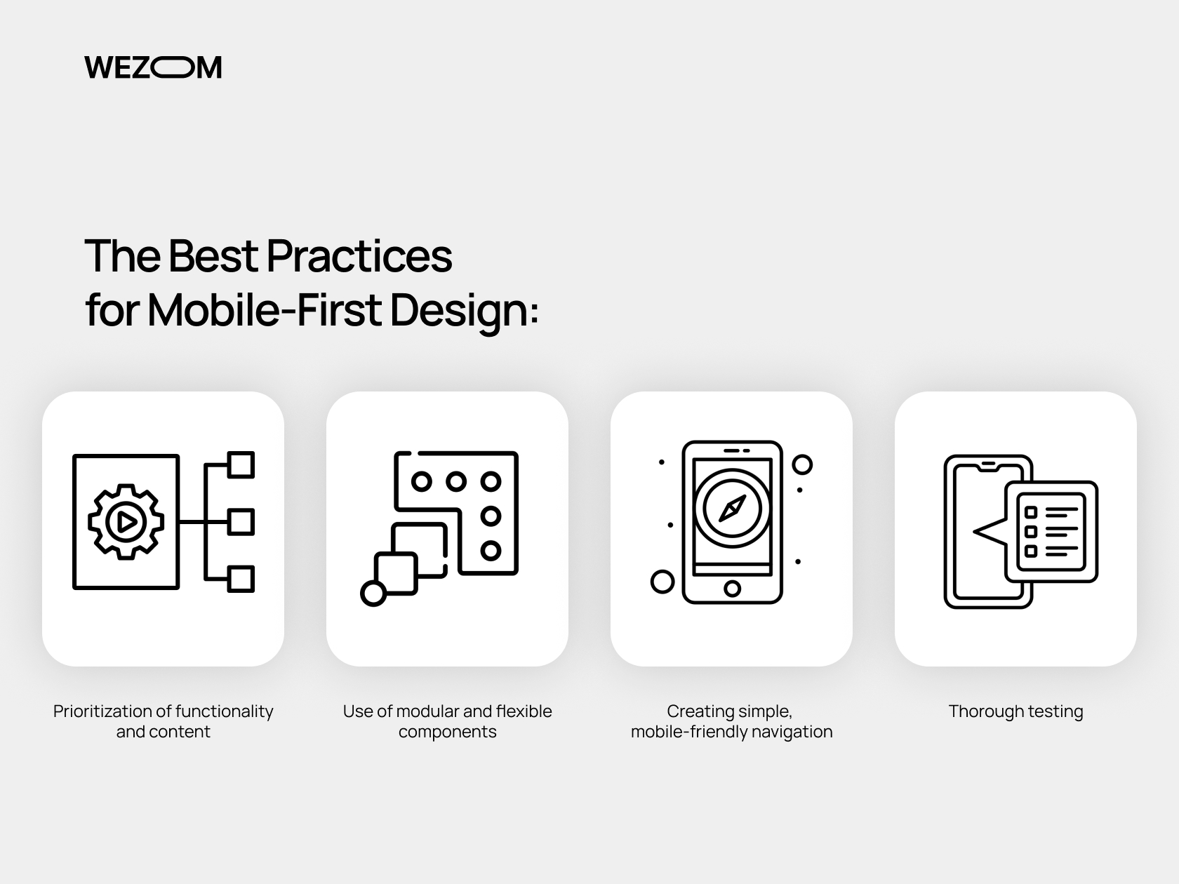
Prioritization of functionality and content
When creating mobile layouts, we define the core features and content that users will look for in your web app or website. Overall, focusing on the core elements helps us provide the appropriate user friendliness for mobile device owners.
Use of modular and flexible components
When creating a layout for mobile devices, we usually use modular components that easily adapt to different screen sizes. This allows us to achieve consistency and ease of use of the solution, regardless of the device on which it runs.
Creating simple, mobile-friendly navigation
Intuitive navigation simplifies user interaction with the solution, positively affects the overall user experience, and increases conversion rates. Often, this intuitiveness is achieved by creating navigation bars and an interactive sitemap if the client makes such a requirement..
Thorough testing
Finally, we subject mobile-first solutions we create to a multi-stage testing procedure that involves using various software tools to simulate the operating principles and physical parameters of mobile devices of the end users.
Final Thoughts
Even though the mobile-first design has many challenges, such as a radical change in the vision and skills needed for the implementation of traditional design approaches, limited physical space, specific requirements for UX/UI and its testing on mobile devices, as well as possible problems with loading speed, the WEZOM team has managed to overcome them with ease. Thus, every time, we launch successful projects that are fully adapted for mobile device owners.
